
Displaying a 2D vector field with D3
D3 is a JavaScript library priamrily used for data visualisation. The API is neat and coupled with modern browsers’ native support for SVG (Scalable Vector Graphics), we can do some pretty funky stuff.
I was recently following a course on Khan Academy that touched on vector fields. I don’t own a copy of Mathematica/Matlab and was wondering if I could draw one in the browser. TL;DR - yes, and it’s actually easy!
We’ll kick this off by trying to plot the vector field \(\vec{F}(x,y) = [-y, x]^{T}\).
Boilerplate
We’re not using jQuery so we’ll rely on the DOMContentLoaded event to trigger our code. Note we’re using d3 v4 (which has some breaking changes compared to v3).
<!DOCTYPE html>
<html>
  <head>
    <script type="text/javascript" src="d3.v4.min.js"></script>
    <script type="text/javascript">

      document.addEventListener("DOMContentLoaded", function(e) {
        // most of our code goes here
      };
    </script>
  </head>
  <body>
    <p>Hello!</p>
  </body>
</html>
Our ‘canvas’ will be an SVG element which we append on the fly:
var width   = 600,
    height  = 600,
    margin  = 100;

var svgSelection = d3.select("body").append("svg")
      .attr("width", width +2*margin)
      .attr("height", height +2*margin)
      .append("g")
        .attr("translate(" + margin + "," + margin + ")");
Axis
Getting a cartesian plane drawn up is relatively straight-forward. We’ll rely on two linear scales - one for the x-axis and one for the y-axis. We use the translate directive to center those in the middle of screen - otherwise they’d be stuck on the bottom and left-hand-side of the screen.
var yScale = d3.scaleLinear().range([height,0]).domain([-5,5]);
var xScale = d3.scaleLinear().range([0,width]).domain([-5,5]);

svg.append("g")
   .attr("transform", "translate(0," + height/2 + ")")
   .call(d3.axisBottom(xScale));

svg.append("g")
   .attr("transform", "translate(" + width/2 + ",0)")
   .call(d3.axisLeft(yScale));
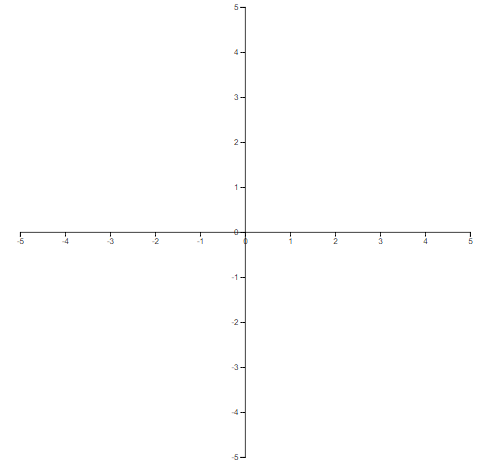
Results so far:
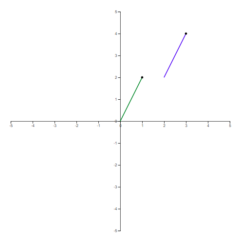
A single vector
Let’s now try to graph a single vector, say for \((2,-1)\). The vector for this will be \((1,2)\), starting at the origin. To draw it we use the path directive. It’s not D3 specific (which has an API to draw lines) but part of the SVG Standard.
We need to apply a transform to shift it to its ‘correct’ position. The original vector is in green and the transformed one in blue.
Instead of the usual arrow denoting the tip of the vector we’ll use pinheads - it’s not as pretty but a lot simpler to draw and just as informative. This is done by drawing a small circle at the tip of the vector using the circle attribute.
// sample vector
p = {x:2 , y:-1,
     vx:1, vy:2,
     magnitude:Math.sqrt(2*2 + 1*1)};

// un-transformed
svg.append("g")
   .append("path")
   .attr("d", "M" + xScale(0) + " " + yScale(0) + " L" + xScale(p.vx) + " " + yScale(p.vy))
   .attr("stroke", "green")
   .attr("stroke-width", 2)
   .attr("fill", "none");

svg.append("g")
   .append("circle")
   .attr("r",3)
   .attr("cx", xScale(p.vx))
   .attr("cy", yScale(p.vy));

// transformed
svg.append("g")
   .append("path")
   .attr("d", "M" + xScale(0) + " " + yScale(0) + " L" + xScale(p.vx) + " " + yScale(p.vy))
   .attr("stroke", "blue")
   .attr("stroke-width", 2)
   .attr("fill", "none")
   .attr("transform", "translate(" + (xScale(p.x) - xScale(0)) + "," + (yScale(p.x) - yScale(0)) + ")");

svg.append("g")
   .append("circle")
   .attr("r",3)
   .attr("cx", xScale(p.vx))
   .attr("cy", yScale(p.vy))
   .attr("transform", "translate(" + (xScale(p.x) - xScale(0)) + "," + (yScale(p.vy) - yScale(0)) + ")");
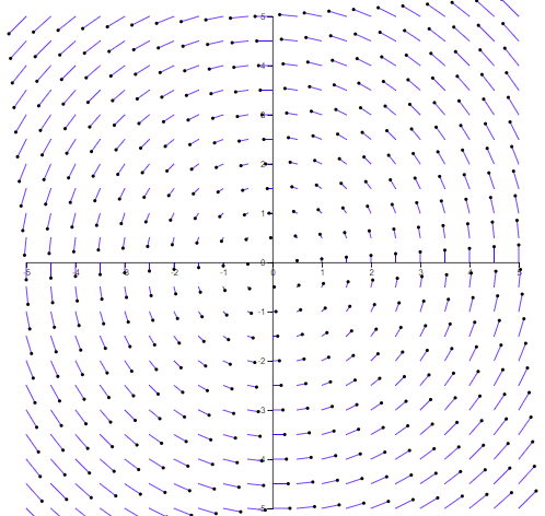
Scaling and multiple vectors
Different vectors will have different magnitudes (or length). If we were to display the actual magnitudes we would soon end off-graph. It makes sense to scale each vector down to minimise overlap.
Whatever the spacing between points, the maximum magnitude should be less or equal to that. So if we were plotting every unit (e.g. -5, -4, …) we’d want the magnitude to be less or equal to 1 to avoid any overlap.
Just like we have scales for the x and y axis, we can create another linear scale:
var grid_spacing = 0.5;
var max_magnitude = data.reduce(function (max_, it) {
            return max_ > it.magnitude ? max_ : it.magnitude;
        }, 0);

var vscale = d3.scalePow().domain([0,max_magnitude]).range([0,grid_spacing]);
Where data is an array of points and magnitude represents the length of each individual vector. Note the use of a power scale to scale the length of the vector - this will help us better accentuate the difference between the extremes (though it can just as easily be changed to a linear one with scaleLinear).
Computing for every point on our grid then looks like this:
var vfield = function(d) {
    d.vx = -d.y;
    d.vy = d.x;
    d.magnitude = Math.sqrt(d.vx*d.vx + d.vy*d.vy);
}

var grid_spacing = 0.5
data = [];
for (var i=-5; i <= 10; i+= grid_spacing){
    for (var j=-5; j<=10; j+= grid_spacing) {
        var pt = {x:i, y:j};
        vfield(pt);
        data.push(pt);
    }
}
Which we can plot accordingly:
data.forEach(function(p)
{
    // we first scale down to a unit vector
    p.vx /= p.magnitude;
    p.vy /= p.magnitude;
    // and now scale it to our own scale
    p.vx *= vscale(p.magnitude);
    p.vy *= vscale(p.magnitude);

    // vector
    svg.append("g")
    .append("path")
    .attr("d", "M" + xScale(0) + " " + yScale(0) + " L" + xScale(p.vx) + " " + yScale(p.vy))
    .attr("stroke", "blue"))
    .attr("stroke-width", 1)
    .attr("fill", "none")
    .attr("transform", "translate(" + (xScale(p.x) - xScale(0)) + "," + (yScale(p.y) - yScale(0)) + ")")
    ;
    // pinhead
    svg.append("g")
    .append("circle")
    .attr("r",2)
    .attr("cx", xScale(p.vx))
    .attr("cy", yScale(p.vy))
    .attr("transform", "translate(" + (xScale(p.x) - xScale(0)) + "," + (yScale(p.y) - yScale(0)) + ")")
    ;

}
Giving us:
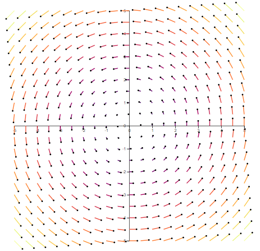
Colour scale
We can do one better though. Instead of using a single colour we can use the magnitude on a colour scale.
var colorScale = d3.scaleSequential(d3.interpolateInferno).domain([0,max_magnitude]);
And changing the stroke attribute to:
.attr("stroke", colorScale(p.magnitude))
Giving us our final result:
Taking it further
You can find the above in a self-contained html file here. I hadn’t really used D3 before so it’s quite likely the code above is ugly at best - and there are better ways to do this. Animating the flow would be great - it often makes vector fields a little easier to follow. So would adding a legend for the colour scale.